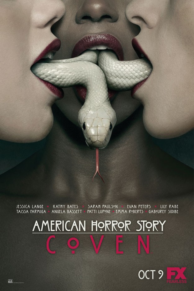
Semiotics have become a part of our every day life and defined by two distinct aspects, the signifiers and signified. The image I have chosen has been labeled as ‘disgusting’ yet still immeasurably ‘intriguing’. This image of course is the promotional poster for the 2013 ‘horror and erotic thriller’, American Horror Story: Coven.
The signifiers within the image are primarily the three female characters. The precise positioning and facial expressions of all three characters also give the poster near symmetry. However, the true centrality of the poster lies with the white snake, which appears to be coiling itself between and through the three females mouths, ultimately linking them all together and alluding to a form of grotesque connection. The text within the image also lets the audience know that this is indeed a promotion for the upcoming release of the third series, further going on to name the majority of the cast, who are all predominately female.
Now whilst the denotation elements of the poster may be widely shared amongst most people, the connotations (signified) are not and are heavily influenced by the viewer’s familiarity with the show itself. People who are not familiar with the show seem to have strong feelings of evil, darkness and disgust evoked from looking at the image. They further feel that the women and snake within the poster are being high sexualised and that the poster alludes to an act of sex. Such opinions and feelings evidently make you think that these people would not wish to watch the series as it is ‘too strange’ and ‘weird’, all commonly believing that it won’t be able to break into the norm or mainstream which is 21st century entertainment.
Other people, such as myself and other fans of the show have completely different connotations in regards to the poster. Louie Bendtsen, a fan of the show since its first season, thought that ‘the intimacy shared between the three characters connected by the snake is something that made me remember the cohesiveness of past casts and got me excited for re-appearing and new actors all together’. The contrast of ethnicity in the poster I believe was also something to think about, as one who is a fan of the show would know that racism and identity became prominent themes within the third season. I also saw beauty within the image and thought that a sense of feminism was being evoked. Whilst the women may have been sexualised due to the red lipstick and the positioning of the snake, I believe that they are still empowered and beautiful. In my interpretation, I believe that with the show being about a coven of 21st century witches, that the snake does not necessarily have sexual connotations, but is rather a representation of the poison and powerful nature of the spoken word and tongue. Furthermore, the all female cast also supports this idea of feminism and women empowerment.
In conclusion, it can be undoubtedly understood that the poster of American Horror Story: Coven does have some controversy tied to it, however the poster did present the creepy aspect and illusive nature that fans of the show know and love. It is also assumed that people will unconsciously interpret media messages or material contrarily depending on their ideological positions, contexts and influences.
– BJS
Reference list:
American Horror Story: Coven, 2013, TV Series, FX, United Sates of America, 2013
Lewis F, 2013, 5 Ways ‘American Horror Story: Coven’ Both Conforms to and Challenges Misogynistic Tropes, The Human Experience. Viewed 23rd, March 2014. <http://the-humanexperience.com/5-ways-american-horror-story-coven-both-conforms-to-and-challenges-misogynistic-tropes/>
Peterson, A. H, 2013, The Exquisite Repulsion of ‘American Horror Story: An Essay on Abjection, LARB The Blog. Viewed 23rd, March 2014.
Turnball S, 2013, Lecture 3, Powerpoint Slides, BCM110, University of Wollongong. Viewed throughout the session.


your posts are well presented and well worded, making them easy to read and comprehend. the layout is also nice and simple to work with.
As someone unfamiliar with the show I too thought the image was purely sexual but when I continued to read on you made it clear that there was deeper meaning behind it. It definitely goes to show that context can change the way this image is read, as without the knowledge of the show a it can be interpreted in a completely different way. Really well written!
Thank you heaps! I’m really glad you commented and told me of your original thoughts of the image. It really does just go to show how easily viewed signs and advertisements can differ! Thanks again!
Hi Blake, I really enjoyed reading this post and further felt that the image you chose was quite peculiar which made it quite interesting and contrasted from the many overused images I have come across on other peoples WordPress blogs. I found that although your image highlights the facial aspect of the three women depicted compared to my own image which only depicts a single woman whose legs are only shown, it is fascinating that even so, both our images highlight connotations and denotations which both arguably highlight the sexualisation of advertising which I thought was great! I think the concept of “shocking” audiences with a controversial advertisement for a a product is a concern for the media and you made this very clear, yet I like how you noted that this can depend on peoples “ideological positions, contexts and influences.” Your opinion is made strong in regard to feminism and women empowerment, due to the fact that you watch this series. With this in mind, do you think that this advertisement is taking advantage of the elements of the TV series and is potentially sending negative messages to easily influenced people who may not watch American Horror Story?